
Dithering and Direction: Navigating Artistic Forks in the Road
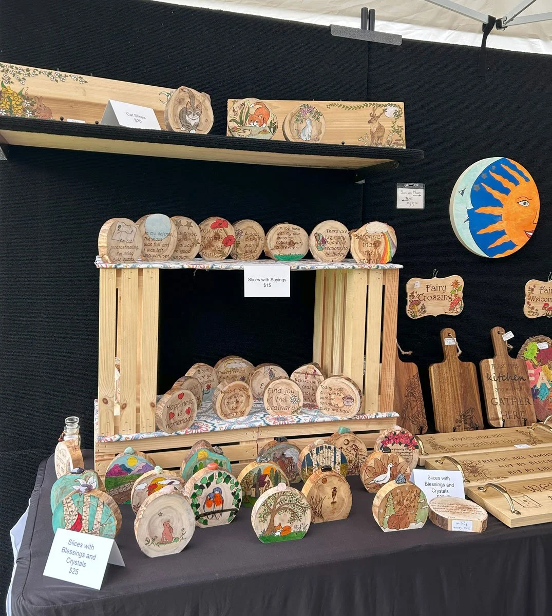
Last weekend I vended at a local lavender festival that hosts a variety of arts and crafts vendors. I was at this same event last year and did very well with my wood burned items. Although I’d decided not to make more wood burned pieces to sell “officially,” I still had a number of blank wood items sitting around. I figured I’d finish them with simpler designs and bring them to the festival.
The results? Not terrible—but not great either. I did about half the business I did last year. Maybe it would have been the same even if I had brought exactly what sold before. There’s nothing so fickle as trying to predict sales for an event from one year to the next. The festival seemed well attended, but it’s hard to gauge how many people are actually buying versus just enjoying the scenery. I’m also aware that the general state of the world is making people more cautious with their spending.
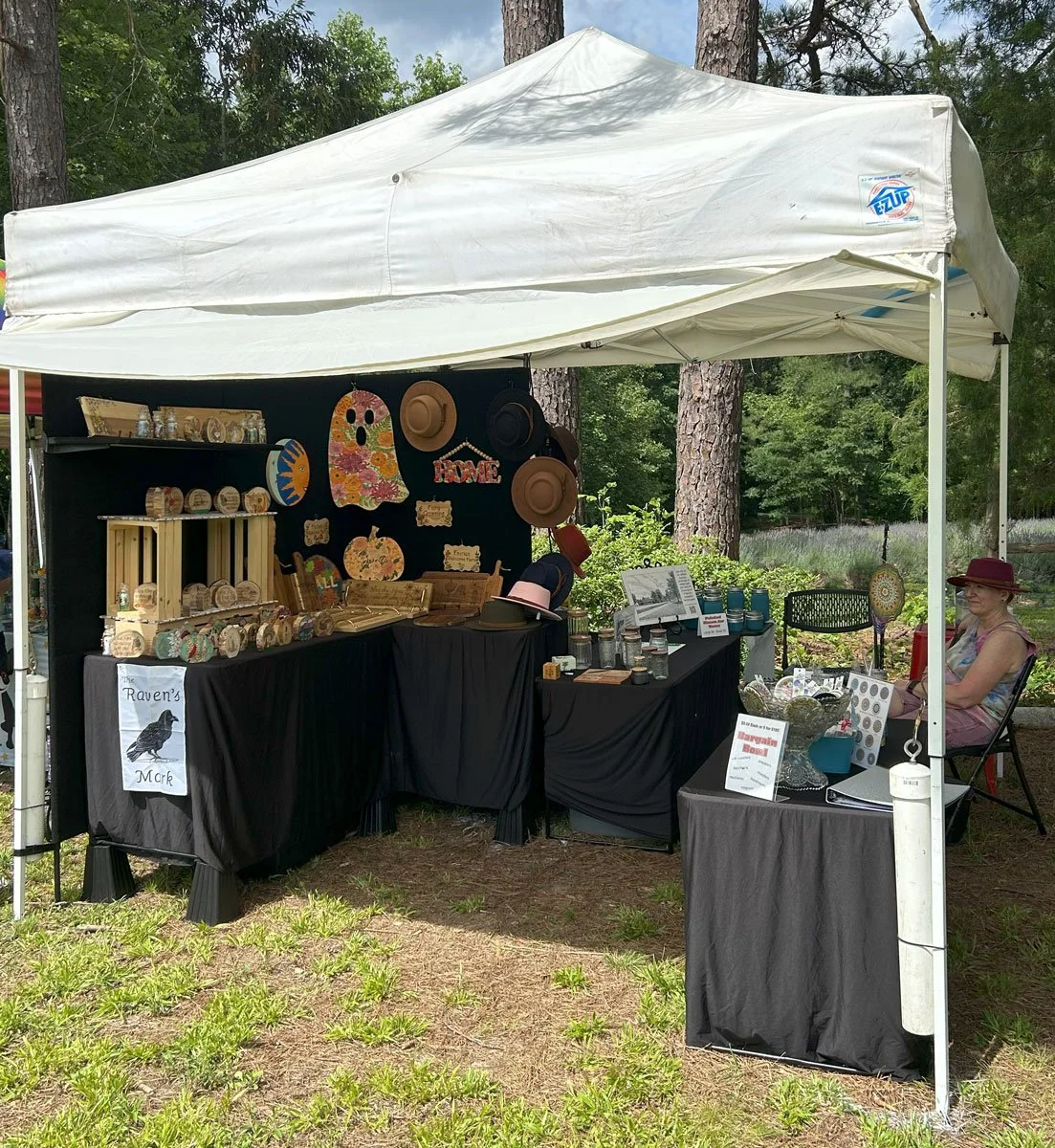
This year I also brought out all my leftover sublimated mandala items, marked as “bargains.” People love a deal, and I priced them right at—or even below—the cost of the blanks, before I added any of my work. I just want that chapter to be done and cleared out. A few pieces did sell, so I was at least pleased to send them off to new homes.
I also brought a printed version of my new pen and ink piece of Appomattox Court House. It was helpful for explaining the evolution of my work. When someone showed interest, I’d gesture to the mandalas and say, “I started with these…” then to the wood burned pieces, “then moved to this…” and finally to the print: “and now I’m here.”
I’d explain how sublimated items with generic designs had become so common among vendors that original work—priced fairly—often didn’t stand a chance. And how the influx of laser-cut wood art made it harder to compete with my hand-burned designs that take hours, while a laser can do similar shapes in minutes. My last line was usually a half-joke about hoping AI doesn’t catch up too fast when it comes to making “fine art that looks like fine art.”
Still, I remain optimistic that art truly made by human hands will once again be seen as meaningful, valuable, and worthy of support. I did find myself, however, feeling like I was making excuses—though it is well-documented that traditional artists are struggling to compete in a market increasingly filled with computer-assisted images, many derived from existing artwork. And to be clear, I don’t mean digital artists who draw with a stylus on a tablet—that’s art. And photographers who shoot their own images and digitally manipulate them? Absolutely photographic art. But when “art” is generated with little more than a text prompt, it’s a different conversation.
As I’ve said before, any time I face underwhelming sales, that little imp in my head wakes up again, whispering: “Who do you think you are, trying to be an artist?” So I do what many of us do in moments of doubt—I go online and start looking at what other artists are doing. And then the dithering starts all over again.
This round of dithering? It’s all about style.
Most of the pen and ink landscapes I find online lean toward “pen and wash”—ink outlines with minimal detail, accented by soft watercolor washes. I’ll admit, I’m drawn to the look. I spent time this week studying it, wondering if I should try it myself. It’s not how I naturally draw—my pieces tend to collect more and more detail until they’re practically humming with it. In pen and wash, the color carries the weight of the piece, and I’m not used to that. Still, when I imagine some of the landscapes I want to draw from my own photos, I see them in color. I guess I haven’t yet learned to picture them in black and white.
I talked about it with my husband, my best friend, and my daughter. All three encouraged me to give pen and wash a try—especially James, who suggested doing the same image in both styles. Since I already had the McLean House in pen and ink, I tried a second version in pen and wash.
It wasn’t as carefully executed. I didn’t take as much time with the drawing, and I had to use the same kind of paper to match the original’s size, which isn’t made for watercolor. That meant I had to go very light with the paint to keep it from buckling. It was more of an experiment in style than a polished piece. If I decide to continue with this direction, I’ll need to improve both my materials and my watercolor skills.
James thinks I should eventually display both versions side by side at future events so people can choose their preferred style. I pointed out that I’d need to improve either approach before putting them out for sale—and I’m old. I don’t want to spend what little time I have left (yes, that was dramatic, and yes, I said it out loud) perfecting a style I may not enjoy or that may not resonate with an audience. So yes. Dithering. Again.
All that being said, here are the two pieces next to each other. Keep in mind, the color version is rougher in execution, and the watercolor is blotchy due to the wrong paper. This is more about comparing styles than judging technique.
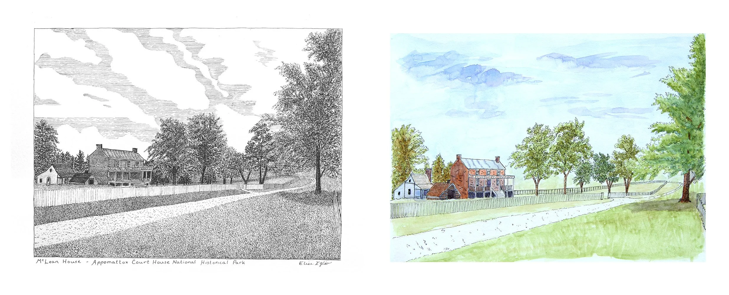
After staring at them both for a few days, I now know which one I prefer. I also know which one I enjoyed making more.
But I’m keeping that to myself—for now.
Which one do you like better?